Posted By Scott at 11/23/2023 9:13 PM
It’s a black and white comic. Get it?
Labels: Ditko, Ditkoctober, Mr. A, Pentel, Photoshop, Steve Ditko
Posted By Scott at 11/22/2023 9:12 PM
I felt like the inks were pretty strong on this one so I didn’t mess with it too much. Very tasteful flats for shadows, some clouds dotted in the background and some basic colour holds on the webbing.
Labels: Ditko, Ditkoctober, Pentel, Photoshop, Spider-Man, Steve Ditko, The Vulture
Posted By Scott at 11/21/2023 9:09 PM
Taking this to its logical conclusion in colours by having a stark contrast of serene, muted colours against the vibrant red of the nightmares with Nightshade’s portal as the delineator. Stuck once again with basic flats for shading, while using some colour holds to push the contrast on the serene landscape further.
Labels: Ditko, Ditkoctober, Nightshade, Pentel, Photoshop, Steve Ditko
Posted By Scott at 11/20/2023 8:00 PM
I will be the first to admit I am not a fan of the colour scheme of this character. The approach here was some tasteful flats to show depth, some emphasis on the lettering and some halftones to play up the 60’s camp of this character/William Shatner look-a-like.
Labels: Creeper, Dit, Ditko, Ditkoctober, Pentel, Photoshop, Steve Ditko
Posted By Scott at 11/19/2023 8:03 PM
This is a fun little trick I’ve used in the past (and in a few pieces in this project) where I apply an opaque gradient on a soft light layer. It normalizes the colours in the gradient a bit, and can be used to create a light source, or in this case, a foreboding red overtone suggesting something bad is about to go down.
Labels: Ditko, Ditkoctober, Pentel, Photoshop, Spider-Man, Steve Ditko, The Lizard
Posted By Scott at 11/18/2023 8:00 PM
Pretty straight forward on this; I wanted a cooler tone to offset the bold colour choices of the outfit while also trying to draw attention to the cosmic and magical elements of a character like this. The galaxy through the window was a lot of fun to create and I think it lends itself well to the character.
Labels: Ancient One, Ditko, Ditkoctober, Doctor Strange, Pentel, Photoshop, Steve Ditko
Posted By Scott at 11/17/2023 7:30 PM
Ultimately, I decided to use the mechanical arms to create an interesting, semi-symmetrical pattern. By the end I actually really like how this turned out. As long as I don’ t think too hard on the fact that it’s J. Jonah Jameson in a very odd looking robotic suit.
I opted for a little throwback to the original colours for the regular J. Jonah Jameson piece. Some basic shading and some texture (which I always label the layer for as “Dirt” for some reason) and this was mostly done. I like the dramatic lighting on this and thought the pattern worked well with the deeper red.
Labels: Ditko, Ditkoctober, J. Jonah Jameson, Pentel, Photoshop, Spider Slayer, Spider-Man, Steve Ditko
Posted By Scott at 11/16/2023 8:00 PM
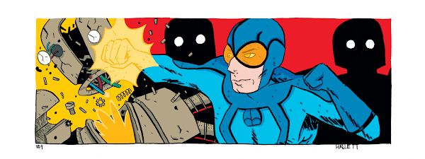
I’ve had a bad habit in the past of of sort of crossing my fingers and hoping that colours would fix issues in a drawing but they almost always result in me overworking a piece, second guessing, and still not hiding glaring anatomy issues.
There are some colour pieces I am very proud of later in the series, but I will always consider this one of my favourites. Very minimal shading and colour holds with no gradient, screen or blurred tricks. Just a man, a plan and a busted up robot. The one colour hold I really enjoyed was borrowing from earlier pieces and taking parts of the panel out to extend the background colour. I feel like it really added a little something extra and made the picture just a little bit more dynamic.
Labels: Blue Beetle, Ditko, Ditkoctober, Pentel, Photoshop, Steve Ditko
Posted By Scott at 11/15/2023 9:00 PM
As much as I was not a fan of the design, this character does have a fun colour palette I can get behind. Again, applying a very minimal amount of shading and effects, I just tried to work within a confined palette. As this character is from the Doctor Strange storyline, I did a little throwback to my first coloured piece of the man himself and brought back some of the halftones to highlight the magic.
Labels: Clea, Ditko, Ditkoctober, Doctor Strange, Pentel, Photoshop, Steve Ditko
Posted By Scott at 11/14/2023 8:30 PM
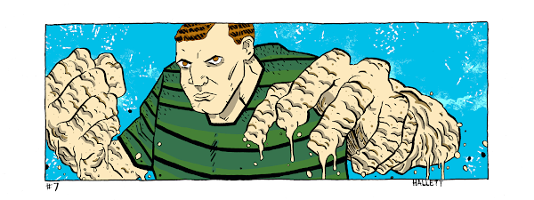
I focused on just the potential for change in the character and how messy someone made of sand would actually be. You’re not walking away from this fight untouched.
By this point in the colouring process I’d started to settle into what was working, what wasn’t and how to carry on the process for the remainder of the work. I recognized that for some of these, overworking a background or even overly detailed shading didn’t make much sense, and the resultant pictures were more of a pop art feel.
For this one, I just went with some very basic shading, some ‘material’ aspects in the sandy parts of Sandman (specks etc.) and a basic colour background that I added some effects to in order to make it appear sandblasted.
Labels: Ditko, Ditkoctober, Pentel, Photoshop, Sandman, Spider-Man, Steve Ditko
Posted By Scott at 11/13/2023 8:00 PM
The original Atom has a orange and yellow colour scheme, so rather than shy away from that I just went a bit overboard on the other colours and added some fun space rainbows and well, atoms. If I had to do this again I might up the saturation a bit on the background elements and take it into a less subdued space.
Labels: Captain Atom, Charlton, Ditko, Ditkoctober, Pentel, Photoshop, Steve Ditko
Posted By Scott at 11/12/2023 8:00 PM
Easy to go wrong with something with as intense of a light source as fire. I tried really hard not to overwork this. Really deep reds and oranges are not in my normal wheelhouse of colours I choose to work with, but I had to embrace it. I think it turned out pretty decent and liked the way some of the highlights and glows turned out!
Labels: Ditko, Ditkoctober, Dormammu, Pentel, Photoshop, Steve Ditko
Posted By Scott at 11/11/2023 5:42 PM
Don’t ask me why I went with pea green for a colour scheme, but I think it worked. I regretted the giant question mark a bit after drawing it, and while I could have redrawn it (or taken it out) I decided to just embrace it. I brought it out more in the colours to highlight some of the cartoon aspects of this drawing. I really liked the backlighting coming from the window on this. It’s a little trick I picked up years ago, and try to use it sparingly so it’s not a gimmick.
Labels: Aunt May, Ditko, Ditkoctober, Pentel, Photoshop, Spider-Man, Steve Ditko
Posted By Scott at 11/10/2023 8:06 PM
This one basically coloured itself! Nightmare has this very garish all green outfit, so I tried to play off that with opposite colours (while trying very hard not to make this Christmas themed). I wanted Nightmare to have the focus, so I pulled back the harshness of the inks with some colour holds very similar to the base colour of the background. Coupled with some lighter gradient as a halo to highlight Nightmare and it was all pulled together.
Labels: Ditkoctober, Nightmare, Pentel, Photoshop, Steve Ditko
Posted By Scott at 11/09/2023 8:01 PM
One goal I landed on pretty early in this process was keeping things light and not overwrought. Some basic shadows, perhaps some elements like splatter or a gradient but nothing too over the top. I think those principles came through pretty well on this one. It’s meant to convey the rage Jonah feels at the thought of Spider-man; that he’s really caught in that web of hate.
Labels: Ditkoctober, J. Jonah Jameson, Pentel, Photoshop, Spider-Man, Steve Ditko
Posted By Scott at 11/08/2023 7:00 PM
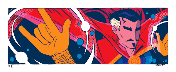
In terms of this drawing, I simply wanted it to be dynamic with lost of magic crackling around him; I wanted the air to feel electric. I did get a kick out of the fact that he was so concentrated that you could only see eyebrows.
This was the first one I coloured, and I think I was still finding my footing a bit on how to tackle these. There’s elements here I would repeat later, such as the halftones or colour holds bleeding out past the image border, but this is the only image where the entirety of it is coloured with no black ink. I thought about approaching it again when assembling them here, but I like the idea of sticking to my original intent and showing progress image to image.
Labels: Ditkoctober, Doctor Strange, Pentel, Photoshop, Steve Ditko
Posted By Scott at 11/07/2023 3:50 PM
I'm proud of having accomplished that, this is the first monthly drawing challenge I not only finished during the month, but early!
Labels: Ditko, Ditkoctober, Doctor Octopus, Electro, Eternity, Green Goblin, Spider-Man, Squirrel Girl, Steve Ditko, The Question


